![]()
The AltiusInsights Dashboard has been developed to show trends in the use of your organisation's EAP Program. There are three screens available to you, which are described here in detail.
Recent changes introduced with the dashboard
- Coming soon: full range of data. We are working to add all historical data to the dashboard beyond the previous 2-year limit. While we undertake this work data back to January 2025 is shown. An update due shortly will provide the full time period of data we hold for your organisation.
- Filter by Organisational Unit. For larger organisations, you can now filter the dashboard to only show units within your organisation.
- All dashboards now show monthly data. We were previously unable to provide those customers with lower usage access to monthly data to protect client identity. With the introduction of privacy masking we now support monthly views for all customers.
- Booking recency statistics. We are now able to show data for the previous 6 months that describes how soon from registration new clients make an appointment. You can see how many new clients get a same-day appointment, one within 2 calendar days and one with 6 calendar days.
- All demographics are now available. previously the dashboard was limited to only showing a fixed set of 6 demographics. The new dashboard shows all demographic data collected for your organisation via a drop down menu
- Engagement rate now shows reported headcount. To help ensure that your program engagement rate is properly calculated, we now display your reported headcount. To ensure an accurate engagement calculation, please provide us with updated headcount information.
-
Unit Level Engagement Rate: Engagement rates are now available at the unit level. To ensure accuracy, the calculation uses your reported headcount where available, falling back to your organisation's headcount if no unit headcount has been provided. Please supply updated headcount information to ensure your engagement rate is calculated correctly.
-
Date Range Selector Across All Tabs: A date slicer is now available across all tabs, allowing you to select or enter a specific date range to filter the data displayed throughout the dashboard.
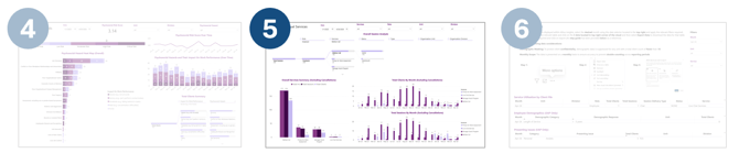
Overview: The 6 Dashboard Sections

Section 1 is a Summary View with the key stats for the EAP service usage. We focus on the information that matters most to you including the program engagement rate, the number of new clients we are seeing to the service and how soon they book appointments, the ratios of the various client roles we support (employees, family members, etc.), and the channels clients are using to access the service.
Section 2 Demographics, allows you to investigate trends among the various client characteristics we collect. These attributes vary by customer and are set up on contract initiation, but generally can include factors such as age group, client type (family/employee), gender, length of service, marital status, referral source and salary grade. Graphs in three formats (ratio, overall proportion and ribbon) portray trends.
Section 3 Presenting Issues, shows the range of issues reported by clients, leading them to use the EAP service. We distinguish between work-related and personal issues, and show the count of clients reporting each issue, as well as showing the trend in that issue over the selected date range, compared to the other issues reported. The share among all clients of the selected issue is also shown.
Section 4 Psychosocial Hazard: Provides visibility into your organisation's psychosocial risk levels, expanding on the insights already available in the existing Presenting Issues tab.
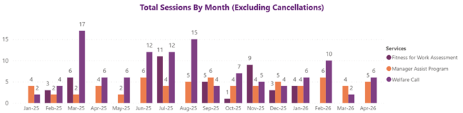
Section 5 Other Individual Services: Covers additional client-based services including MAP, Welfare Calls, Fitness for Work assessments and more.
Section 6 Downloadable Data: Allows you to download your organisation's data across three areas (EAP and other individual service usage, client demographics by primary role and client presenting issues) all filterable by month & unit.
Navigation
To move between the three sections, use the tabs at the bottom of the window:
![]()
General Features
There are several features that are shared across all the Sections of the Dashboard.
Data Download Option for Individual Charts
You can download the data for any chart on the page using the [...] button that displays when you hover your mouse pointer over a graph:
![]()
Then click on Export Data

Choose Summarised Data and the file format you wish to download to:

To download large volumes of the data that underpin the dashboard, see Section 6: Downloadable Data.
Filters
Two categories of filters are offered on the dashboard: filtering by client role, and organisational hierarchy filters. Both of these limit the data shown in the dashboard to your selections.
Client Roles: If your organisation offers EAP access to more than just employees, then those additional groups of clients will be shown in the Client Roles filter, as well as throughout the dashboard. For example, to see data for just employees, choose Employees from this dropdown. To see Employees and Contractors (if you have a role named this) you can select them both from this filter.

Organisational Hierarchy: PeopleSense uses a hierarchy with the following structure: Organisation > Unit > Division > Department. While these are the PeopleSense terms for hierarchy, your use of these terms may differ. We allow filtering on the dashboard to the Unit level.

Privacy Protections
A reporting privacy principle we follow is that we do not show detail for any reporting period with fewer than 10 employee clients in it. To ensure that this is followed in your dashboard, any column of data with fewer than 10 employees will be masked to only show the total in the column, and not any detail of the population within it. This allows you to see data down to a monthly level of detail, and filtered to Divisions without there being a risk to the privacy of our clients.
1: Summary View
We'll dive into each of the areas in the Summary View.

Summary Statistics

Total Clients: The number of unique clients we have seen, listed by their Role.
Total Sessions: The number of sessions that have occurred by Role. Sessions are an appointment that involved a consultation between a Psychologist and a client.
Average Sessions: The average number of sessions per client by Role. Noting that some clients will have a program of care in progress, this number will always average somewhat lower than for all clients who have completed a program of care.
Median Booking (Days): The number of calendar days between an appointment being booked and it occurring. Note that clients are encouraged to make bookings at times that suit them and may make appointments into the future to plan their program of care.
Cancellations: The percentage and number of cancelled appointments that were then charged to the funding organisation. This occurs when a cancellation takes place within 24 hours of the appointment time, or the client did not attend.
New Client Booking: The time between a new client registering for the EAP service and their first appointment. We show how many clients had their first session take place the same day that they registered, how many had their first appointment within 2 calendar days and how many within 6 calendar days.
Clients by Engagement Type: Listing each Role clients may have, we show how many are new or returning. Note that clients are considered new for their first appointment, and returning for each subsequent appointment. If a client has two appointments in the same period then they will be counted as both new and returning for that period, but only as returning from then on.Engagement Rate

Engagement rate shows the proportion of your employees using the service in the most recent year. The colour will vary in comparison with national targets: red for under 5%, yellow for 5-15%, and green for above 15%. The national rate of mental health issues reported in Australia is also shown for comparison.
The calculation is simply:
( [number of clients in the last 12 months] / [number of employees] ) * 100
If there are fewer than 12 months of data, the number of clients is adjusted to make it a 12-month value. In the following example, 9 months of data is available:
((( [number of clients ] / 12 ) * 9 )) / [number of employees] ) * 100
To help ensure that your program engagement rate is properly calculated, we now display your reported headcount. To ensure an accurate engagement calculation, please provide us with updated headcount information.
New Clients Adoption

New Users: A client is attending the EAP service for the first time.
Returning Users: An existing client returned and attended a session.
Clients are considered new for their first appointment, and returning for each subsequent appointment. If a client has two appointments in the same period then they will be counted as both new and returning for that period, but only as returning from then on.
Client Volume by Role

If your organisation provides EAP access to clients who are family members, or have other roles relative to your organisation, this graph simply shows the proportion of those clients accessing the service. The data shows the number of clients in each time period. A single client may visit the service in multiple months and will therefore show in each month.
Sessions by Channel of Service

The pattern of channel use is shown in this graph:
In-Person: the client attended a PeopleSense office for their session. In some cases we offer on-site EAP sessions and these fall into this category too. This session type has also been referred to as "face to face" in earlier reporting formats, but with the advent of online collaboration platforms we have moved away from this term.
Video: the session was held via our telehealth service.
Phone: the session was completed via a phone call.
Chat: The session was delivered over text-based messaging.
Interactive Features
You can click on a category in one chart to see that data in another chart. For example, by clicking on "Family" in the Clients by Role chart you can see those family members in the Sessions by Channel chart:

2. Demographics
Next, the Demographics view:

This section allows you to explore the categorisation of clients using the EAP service and trends in service usage over time by these categories. The specific dimensions available to you will depend on the selections you made when your EAP contract was set up. In the following example we show a sample set of dimensions to illustrate how Demographics Explorer works.
Demographic Selection

The demographic dimensions available to your organisation show in the Demographic drop down. In the new version of the dashboard, all available demographics are shown.
Chart View Area

In the Chart area, you see the trend over time in the selected dimension or demographic attribute.
Proportion over time: shows the month-by-month variation of the selected demographic.
Unique Individuals: Shows the proportion across the life of your program.
Volume over time: Shows the client counts for each demographic over each month.
Interactive Features
You can click on a category anywhere in the view to see if reflected in the other charts:

3. Presenting Issues Explorer
Next, the Presenting Issues view:

When clients start an episode of care with us, we seek to understand the primary issue they are looking to address. This presenting issue becomes an attribute of their profile. In the Presenting Issues view you can see the unique client volume of issues that clients from your organisation are expressing, and see the trend in specific issues over time.
The presenting issues screen provides different lenses into this data:

Volume of Presenting Issues: Shows the all-time count of clients with the displayed issues.
Individuals with Work or Personal Issues Disclosed: Shows the number of clients presenting with work and/or personal issues, noting that clients can present with both a primary work issue and a primary personal issue, so client count totals here may exceed your client totals overall.
Category By Month: simply shows the ratio of personal and workplace issues by month.
Most Common Presenting Issues: shows the trend over time for the top 5 issues by month
Interactive Features
You can select an issue or category from anywhere on the chart, or via the Category drop down, to filter the display. In the example below we use the Category filter to show only work-related issues.

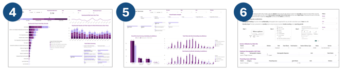
4. Psychosocial Hazard Explorer
Next, the Psychosocial Hazard view:
The Psychosocial Hazard view provides visibility into the risk levels present across your organisation building on the insights already available in the Presenting Issues tab. Here you can see the unique volume of clients identifying with a specific workplace hazard and track how these risks are trending over time.
Psychosocial Risk Score: A weighted metric that quantifies your organisation's exposure to psychosocial hazards. Scores are proportional to the severity of impact on work performance. The greater the impact, the higher the risk level indicated.
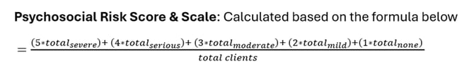
Risk Level Gauge: A visualisation that translates your organisation's Psychosocial Risk Score into the relevant risk classification. The score range is divided into five bands, from No Risk (0–1) through to Critical Risk (4–5), providing an assessment of overall risk exposure.
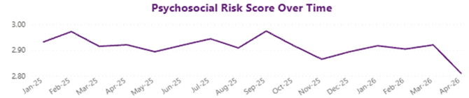
Psychosocial Risk Score Over Time: A chart that visualises the trajectory of your organisation's Psychosocial Risk Score over time. Enabling ongoing monitoring of psychosocial risk exposure.
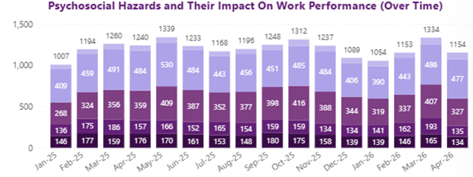
Psychosocial Hazards and Their Impact on Work Performance (Over Time): A visualisation tracking the monthly number of clients who presented with a work-related presenting issue, mapped to its corresponding psychosocial hazard and the impact it had on their work performance.
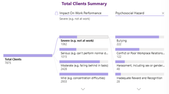
Total Clients Summary: A decomposition tree displaying the total number of clients who presented with a psychosocial hazard during the selected time period, along with the impact on their work performance. Unlike the Psychosocial Hazard Heat Map, this view leads with work performance impact, making it easier to identify which hazards carry the greatest consequence.
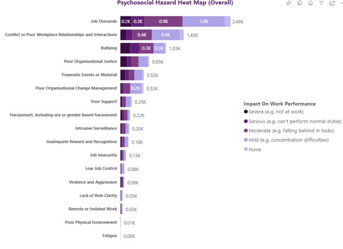
Psychosocial Hazard Heat Map (Overall): A visualisation displaying which of the 17 psychosocial hazards are present in your organisation's workplace, along with the total number of clients who presented with each psychosocial hazard and the impact on their work performance over the selected period.
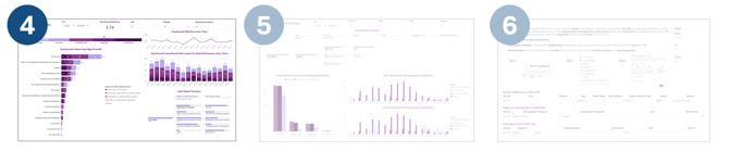
5. Other Individual Services
Next, the Other Individual Services view:
The Other Individual Services view covers additional client-based services that fall outside of usual EAP counselling sessions which includes Manager Assistance Program, Welfare Calls, Fitness for Work assessments and more. Here you can see the unique volume of clients engaging with each service type and track how the utilisation of these services is trending over time across your organisation.
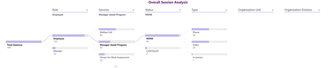
Overall Session Analysis: A decomposition tree displaying the total number of sessions across individual client services (excluding EAP Counselling), broken down by key appointment details including status, delivery method, role within the organisation, organisational unit and division.
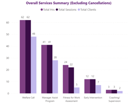
Overall Services Summary (Excluding Cancellations): A clustered column chart displaying the total hours, sessions and clients for each individual client service over the selected period, excluding cancellations. Each service is represented along the x-axis, allowing for easy comparison across service types.
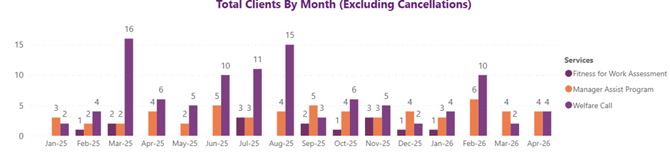
Total Clients By Month (Excluding Cancellations): A clustered column chart displaying the total number of clients for each individual client service over the selected period excluding cancellations. Each month is represented along the x-axis, with individual columns representing each service type, allowing for easy comparison across services month by month.
Total Sessions By Month (Excluding Cancellations): A clustered column chart displaying the total number of sessions for each individual client service over the selected period excluding cancellations. Each month is represented along the x-axis, with individual columns representing each service type, allowing for easy comparison across services month by month.
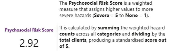
6. Downloadable Data
Finally, the Downloadable Data view:
The Downloadable Data view allows you to export your organisation's data across three key areas (EAP and other individual service usage, client demographics by primary role and client presenting issues). All downloads are filterable by month and at a unit level, giving you the flexibility to extract the data most relevant to your needs.
For instructions on how to download your organisation's data, please refer to the guidance available on the dashboard. Note the following limitations:
Demographic Masking: To protect client confidentiality, demographic data is suppressed for any unit or organisation with a total client count of fewer than 10.
Monthly Scope: Data is presented on a monthly basis to prevent double counting across reporting periods and ensure accuracy.
![]() Service Utilisation by Client File: contains appointment level data for all individual services received by your organisation which includes appointment status, delivery type, organisational role, unit and division and total client and session counts.
Service Utilisation by Client File: contains appointment level data for all individual services received by your organisation which includes appointment status, delivery type, organisational role, unit and division and total client and session counts.
![]() Employee Demographics (EAP Only): contains employee demographic data for EAP Counselling clients within your organisation. Note: that demographic data is suppressed for any organisation or unit with a total client count of fewer than 10 to protect client confidentiality.
Employee Demographics (EAP Only): contains employee demographic data for EAP Counselling clients within your organisation. Note: that demographic data is suppressed for any organisation or unit with a total client count of fewer than 10 to protect client confidentiality.
![]()
Employee Demographics (EAP Only): contains presenting issues data for EAP Counselling clients within your organisation, covering both personal and work-related issues, alongside total client counts and their associated unit and division.
If you have further questions about the data behind AltiusInsights or which to investigate certain trends or aspects of the data, please contact your account manager or email us at AltiusInsights@altius-group.com.au.